🎯 v1.11.2: Goals at a Glance, Bank Notes, a Week Calendar on Your Phone
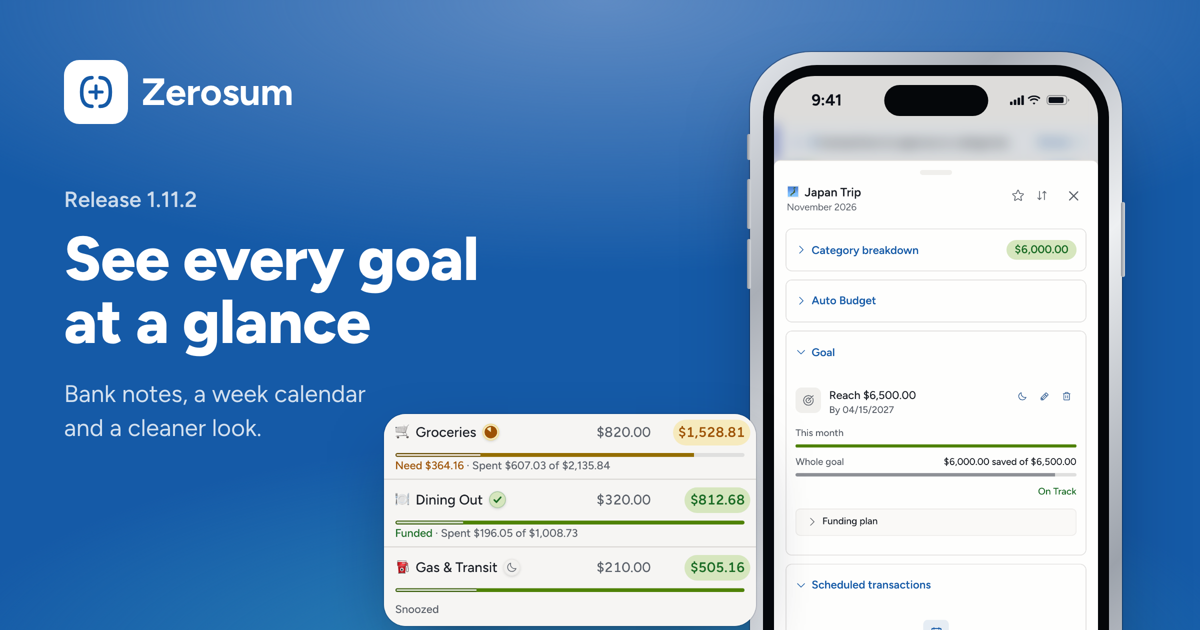
How are your goals doing? The goal icon now tells you at a glance. Linked accounts can bring in your bank's notes, the phone calendar opens on a week, and the whole app looks cleaner and calmer.
🎯 Goals at a glance
- New: the goal icon shows how it's doing. The icon beside each category's name on your budget is a tick when the goal is funded, a pie that fills as you get closer, and a moon while it's snoozed.
- New: two bars for bigger goals. When a goal reaches past this month (a dated target, a yearly bill, paying off a card), click its icon, or open the goal card in the side panel, to see a This month bar and a Whole goal bar.
- New: hide the icon if you prefer. On the Budget page, turn off Goal icon under View → Show. Your goals stay in the side panel.
🏦 Bank sync and payees
- New: Import bank notes. On the Bank Sync page, each linked account has an Options button (Import options on your phone). Turn on Import bank notes to fill empty notes with your bank's memo. Transactions you already have stay as they are.
- Changed: link or manual, first. Add account now starts by asking Link a bank account or Add it manually, and linking shows your bank accounts from every connection in one list.
- New: see why an import got its payee. Click the bank icon on an imported transaction (on your phone, open its details) to see the name your bank sent and the rule that matched it, with Edit rule right there. Manage payees is rebuilt too, with one page per payee for its auto-fill and rules.
- New: reconcile with pending. Some banks report a balance that already includes pending transactions. When yours does, the reconcile dialog now says Balances match instead of showing a difference.
📱 On your phone
- Changed: one tap opens the details. Tap any transaction, on any list, to see its details with the decision first: Approve or Reject for one waiting for you. Tap Edit for the full editor.
- New: approve in one tap. Every transaction waiting for approval shows a ✓ on its card, wherever it appears.
- New: a week strip calendar. The calendar now rests on one week, so the list of days below gets more room. Swipe it to move a week, or tap the chevron to open the whole month. The month's In, Out and To come sit on top.
- New: iPad gets the phone layout. On an iPad held upright, Zerosum now uses the phone layout instead of squeezing the computer layout into a narrow screen.
→ Calendar · Transactions
🎨 A cleaner, calmer look
- Changed: light and dark, rebalanced. Light mode is brighter, with near-white registers. Dark mode is quieter, with more depth.
- Changed: icons in your register. A slim column at the start of each row shows what it still needs (approval, a category, a match to check), and status and tags are icons: a filled check for cleared, a lock for reconciled, each tag's icon in its color.
- Changed: categories as plain text. Category color dots are gone from your budget and register, and colors now appear only in Analytics. In Settings → Appearance, themes are grouped as Featured, More themes and Neutral.
- Heads up: the sidebar is dark again in light mode. Turned Dark sidebar off yourself? It stays off. Prefer it light? Turn it off in Settings → Appearance.
🧮 Also in this release
- New: the Overview page greets you by name, and its sentence about the month turns green when everything is covered, amber when a category needs money, red when you've overspent.
- New: hide notes in your register: Notes joins Tags and Receipts under View → Show.
- New: tick a few transactions and Export saves only those.
- Heads up: Sign in with a code is gone from the login page. No password yet? Use Forgot password? to make one.
As always, thank you for the feedback that shaped this one. 💙