🏠 v1.10.5: Choose Your Home Page, New Overview Widgets, One-Tap Review
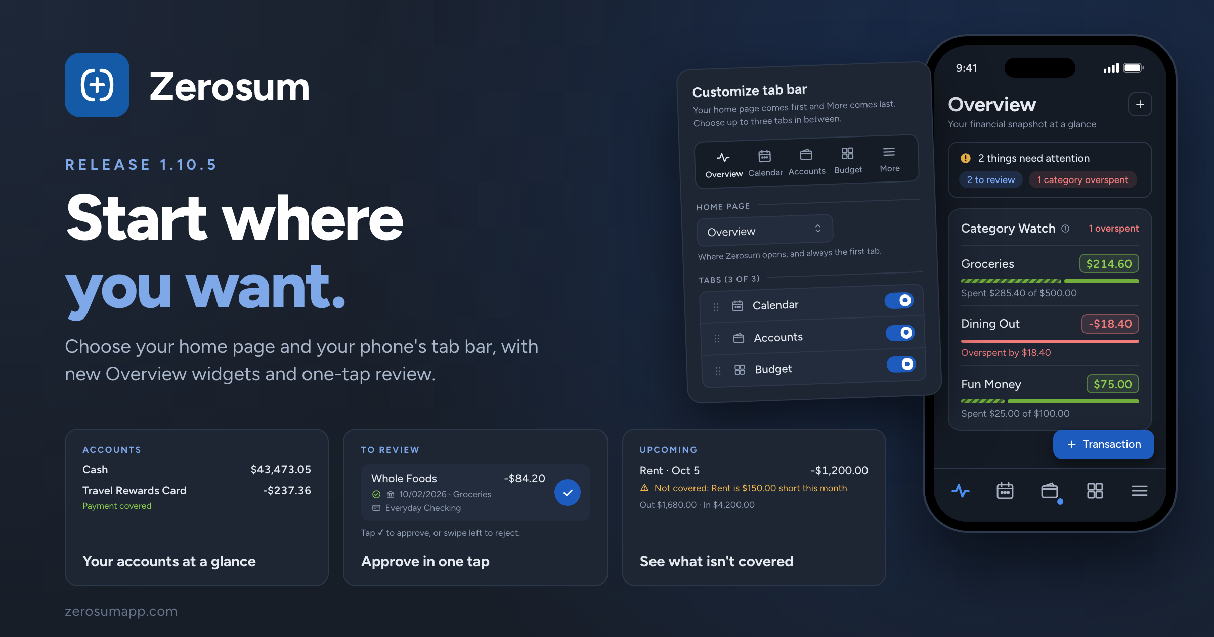
Zerosum now opens where you want it to. Choose the page Zerosum opens on and the tabs on your phone's bottom bar. Alongside it: two new Overview widgets, one-tap review on your phone, filters that stay with each register, and a fix for scheduled transfers.
🏠 Your home page, your tab bar
- New: choose your home page. Budget, Calendar, Accounts, All Transactions, Overview, or Analytics. Zerosum opens there when you launch it or sign in, and when you switch budgets. Set it in Settings → Preferences → Home page.
- New: customize your phone's tab bar. Your home page comes first and More stays last. In between, pick up to three tabs and drag them into order from Settings → Preferences → Mobile tab bar → Customize. It replaces the Mobile dock shortcut, and your bar stays as it is until you change it.
- The + Transaction button follows you home. On your phone, it now also shows on your home page.
→ Settings
📊 More from your Overview
- New: Category Watch. Your favorite categories with the same progress bars and status as your budget. Tap one to open it in the budget. It's part of the default layout; if you've customized yours, add it from Add Widget.
- New: Accounts widget. Your cash accounts and credit cards with totals, plus whether each card's payment is covered. Add it from Add Widget.
- Improved: a fair spending comparison. Spent This Month now compares with the same point last month, so early in the month it no longer looks like a big drop. Prefer the old way? Choose All of last month under Compare spending with in the Snapshot's settings.
- New: see which bills aren't covered. Upcoming marks scheduled transactions whose category can't cover them as Not covered, and totals what's going out and coming in.
- Attention chips open the budget filtered. The overspent and underbudgeted chips open your budget with that filter on, so the categories that need you are right there.
✅ Review faster on your phone
- New: one-tap Approve. Review cards are a single row with an Approve button. Swipe right to approve or left to reject.
- Simpler Pending at bank. No more buttons on each row: tap to open, swipe right to enter it now, or swipe left to reject.
🔍 Registers that remember
- New: filters stay with each register. Every account and All Transactions keep their own search, filters, and preset on this device.
- Changed: To Review has its own filters. Leave it with Done and your register's filters come back.
- Your forecast window syncs. How far ahead forecasts show now follows you across devices, in the register and on the Overview's Upcoming card.
- Fixed: Tab past an empty payee. In All Transactions, Tab now moves on to the category instead of bouncing back.
- Fixed: rejecting a scheduled transfer removes both sides. No more leftover half asking for a category.
As always, thank you for the feedback that shaped this one. 💙
1 comment